The work:
Retained creative partner including:
We heard:
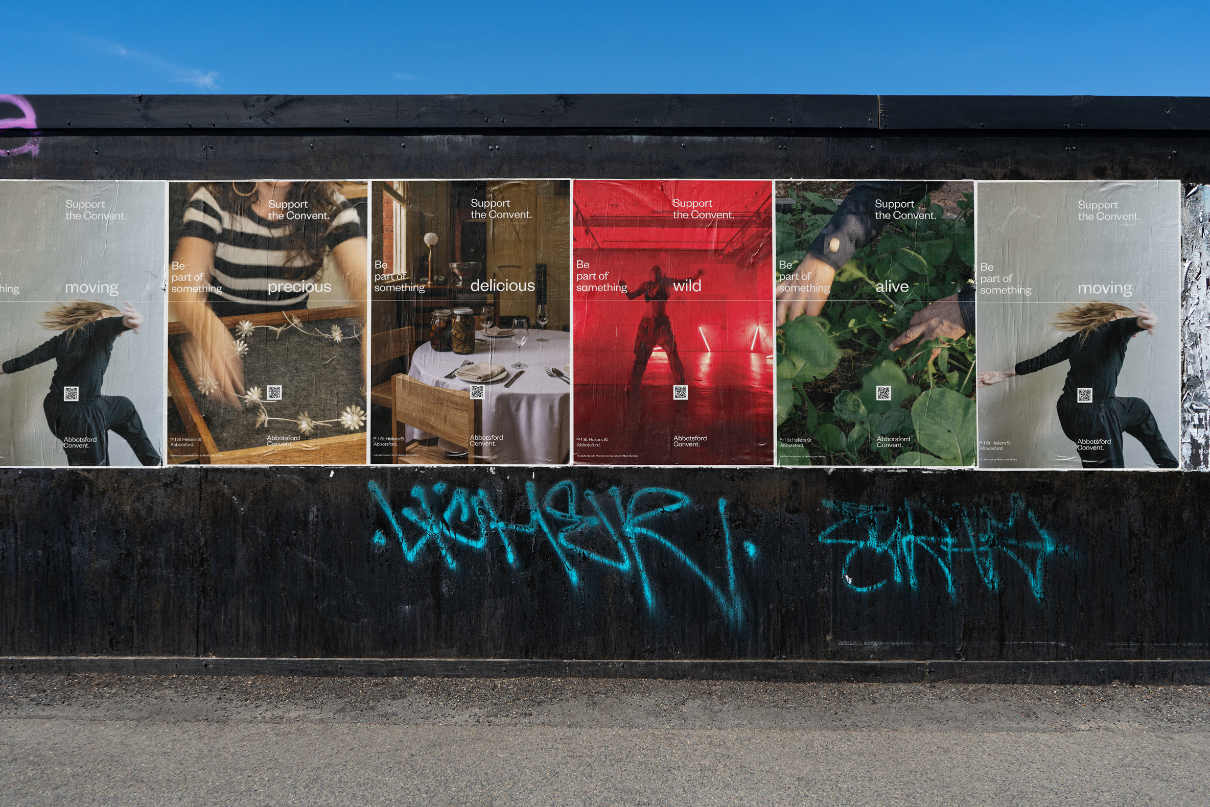
Australia’s largest multi-arts precinct, needed a bold new identity: one that captured its creative soul, rich heritage, and growing ambition. The existing brand no longer reflected the vibrancy or diversity of the precinct or the that community is drawn to it. The challenge was to evolve its visual identity to better communicate complex the layers of history, culture, and purpose across the Convent.
The brand needed to be quickly put to work: to enhance the experience of the place, through visually evocative signposting, to build new audiences for a revitalised public program, and to continue to secure legacy by cultivating community support for its next chapter.
The difference:
A revised brand that doesn't just represent the Convent, but lives and breathes it. We developed a place brand that was as expressive and eclectic as the precinct itself. At its core: a dynamic visual system inspired by the Convent’s architectural forms, natural surrounds, and creative energy.
Through combined executive creative direction, mentorship and embedded support, the Convent's campaigns have seen marked increases in visibility, coherence, and audience engagement. Programming has enjoyed an uplift in ticket sales, and giving campaigns are yielding new donors and support.
Website: abbotsfordconvent.com.au